Creating the poster for 'Wing it!'
- Article
- 11 February
- 8 min read

Other Authors

For each major movie project released by the Blender Studio, a movie poster is created and designed prior to the movie's release. This usually happens near the end of production, when some team members have completed their tasks and have spare time to work on designing the poster. The timing of the poster's design often aligns with the end of production because by then, the assets, coloring, and final look of the movie are complete and can be incorporated into the poster.

What’s the purpose of a movie poster?
Movie posters are often used to promote films and attract audiences by creating excitement and curiosity. They showcase key information like the movie's title, release date, cast, and director. The visuals and design convey the film’s genre and tone, giving potential viewers a sense of what to expect. Posters are displayed in theaters, public spaces, and online to reach a wide audience. Ultimately, they are a marketing tool designed to persuade people to watch the movie.
In the case of Blender, it is used for communication, exposure but also as a celebration of the finished product. It’s a team effort and it is great to receive something that is physical. Therefore not only the poster is created, also crew t-shirts and sometimes even mini figurines are made in order to celebrate a wrapped project.
Initial Poster Ideas
To come up with an interesting idea for the poster, it’s important to know what you want to communicate with it. What conveys the movie in a single image, but doesn’t give away the main plot? You want to sell the essence of what the movie is about, but keep the audience curious enough to see how the story unfolds. For Wing it!, I made a few quick suggestions for the team to pick one from, simply to check if Im going in the right direction.

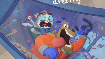
The poster needed to feature the interior of the rocket's cockpit along with the two (or rather, three) characters inside it. The rocket's interior was chosen because it is central to the conflict between the cat and the dog, and it also showcased the team's significant effort and attention to detail. The interior stood out both aesthetically and technically, making it a strong choice for the poster. Built in a modular way to match the movie's whimsical, cartoonish style, it was a perfect fit for this purpose.
The characters were to be depicted in stark contrast: the cat in sheer panic, while the dog, at the steering wheel, appeared to be having the time of his life. This contrast highlighted the tension and conflict between the two characters without revealing the full plot. The official concept for the poster was ultimately chosen: the dog, cat, and chicken are shown frantically holding on to each other in a rocket that appears broken. This design effectively conveyed the movie's theme and core conflict. The rocket is depicted launching into the air while visibly damaged. The dog sits behind the steering wheel, which has broken off, referencing the inciting incident where the rocket was not ready for flight.
Creating the scene file
As the idea was established, a new scene file was created. This scene file had a different output resolution than the movie, so it accommodates the poster format. The resolution of the scene is 4525x6400 pixels. A preset from previous productions was used for printing the poster. The scene file included the characters, the rocket's interior, the rocket's exterior, and a mockup for the title, subtitle, and credits. While the mockup would eventually be replaced with the final title design, it was sufficient for the time being to allocate space for these elements.
Balancing the poster composition
Now this came also with a challenge, because posing 3 characters with a clean and readable silhouette can be challenging on it’s own, furthermore with a very detailed and busy background like the cockpit interior, which adds to the complexity of the overall image. Next to this, it was also important to read the incident; the steering wheel has been broken off by the dog. To find a good balance with all of these components took a bit to tweak and set right.
For the poster we used similar techniques as interior shots in the movie to get a clean image with readable characters and a complementing background. The first one is to pose the characters first and make sure the surrounding elements are supporting their silhouettes and leave room for the proper negative spaces. The second one is to design the background with all of it’s nobs and levers that enhances the composition, design and balance of the overall image.

When this would be designed by a 2D artist, they would neatly place every element of the background and not let any object be simply left to be coincidental. This technique of posing the entire background has been implemented in each shot of the movie and was also done for the poster to embrace that 2D background designed look. Avoiding overlapping levers and buttons, enhancing the main curvature of the cockpit, supporting the line of action happening with the characters.
The third method used to enhance the readability of the image and balance it, is to play with lighting and colors. The characters were intentionally more contrasty and saturated compared to the background, which had a more blue tone and desaturated. This also was coming from the method we used during production and could be easily applied here as well.
Combining the Rocket’s interior and exterior
As shown on the final poster, the composition also includes parts of the rocket's exterior. The interior and exterior are two separate sets. This separation is intentional to keep things modular; for the interior, we don’t want the exterior intersecting with any deformations applied to it. Additionally, to optimize shot files, we only load the set necessary for a particular shot. For the poster, however, it was necessary to combine both sets to provide a glimpse of the rocket from the outside. The exterior was deformed and adjusted toward the camera to fit the composition. Alongside this, 2D touch-ups were done on the exterior in Krita, adding details and fixing minor inconsistencies from the 3D rendering. Lighting and Rendering
Once the characters, props and background were roughly posed by me, it could already be taken over by Andy and Beau who did the lighting pass. Render and shading parameters could be simply used from the movie production files. After a few iterations it was good to be rendered final and exported for Vivien would do the final corrections and touch-ups in Krita. Because we were only rendering a still image, we didn’t have to tweak every pixel to be perfect and allowed the lighting team to skip over some minor rendering errors that could easily be fixed in Krita. This sped up the process significantly and would make the poster finish on time.
Title design and touch-ups in Krita
The title of the poster was inherited from the movie’s title design and simply had to be vectorized in order to be scaled up to the correct format. The vectorization process was done with Inkscape.

The final touch-ups and corrections would be done within Krita, where Vivien Lulkowski would enhance the render coming from Blender as well as incorporating the final Title design and credits. Apart from the interior and exterior rendering of the rocket, the sky was painted in by Vivien, adding some subtle clouds to it.

Painting over the render also allowed for fixing linework issues less painfully than trying to optimize the render as if it was gonna end up as a frame in the movie.
Apart from fixing minor rendering errors there was also the request from Rik to enhance some posing on the characters and to add some 2D effects on top of the rendered image.
Some elements like the sparks on the steering wheel base, intensity lines around the characters and speedlines on the exterior were added to enrich the final design of the poster.

Preparing for test printing
We print our own posters at the studio using our poster printer. Sebastian Parborg helped set up the printer for the initial test print. This step is primarily to calibrate the colors and ensure they come out of the printer correctly.
Once the colors look good and the printer settings are properly configured, the poster is ready for its official print.

Conclusion
When we create a poster for each of our movie projects, we love to build on what’s worked before—taking templates and techniques from past posters as a solid starting point. But every time, we discover new tricks, fresh ideas, and little tweaks that make the process even smoother. Wing It! was no exception! We made some small but mighty improvements that we’ll definitely keep in mind for future projects. But at the end of the day, the real magic happens through teamwork—bouncing ideas around, fine-tuning details, and bringing everything together to create something awesome. And honestly? I’m thrilled with how this poster turned out! With all the final color adjustments, it feels like a true piece of art, proudly hanging in our studio window.
Want to check out the files? You can grab them below!

1 comment

Looking really Good :-) I thx for sharing the files... Also, the new Studio web site is a fantastic refresh. Congrats to all the ppl behind it.
Join to leave a comment.