Properties UI
CloudRig lets you build a custom rig UI, containing built-in properties, custom properties, and even operators. This page aims to guide you through that process even if you're new to Blender as a whole.
What are Custom Properties?
In Blender, you can define Custom Properties on objects or bones. You can specify their name, min/max/default values, tooltip, whether they're a floating point number, a whole number, a boolean toggle, a color, and so on. You can then use Drivers to connect these properties to your character and/or rig, to allow animators to intuitively configure things.
Use case examples:
- An integer property to swap between different outfits, by driving the visibility of objects and modifiers.
- A boolean toggle to switch between two different rig behaviours, by driving the influence of a set of bone constraints and bone properties.
- A color property to change the eye color of a character, by driving an RGB node in a material.
Some general tips:
- Be sure to properly set the default value of each property.
- You can reset any property in Blender to its default by mouse hovering it and hitting Backspace.
- You can enter a Description for properties, which will be shown when they are mouse hovered.
CloudRig's UI Editor
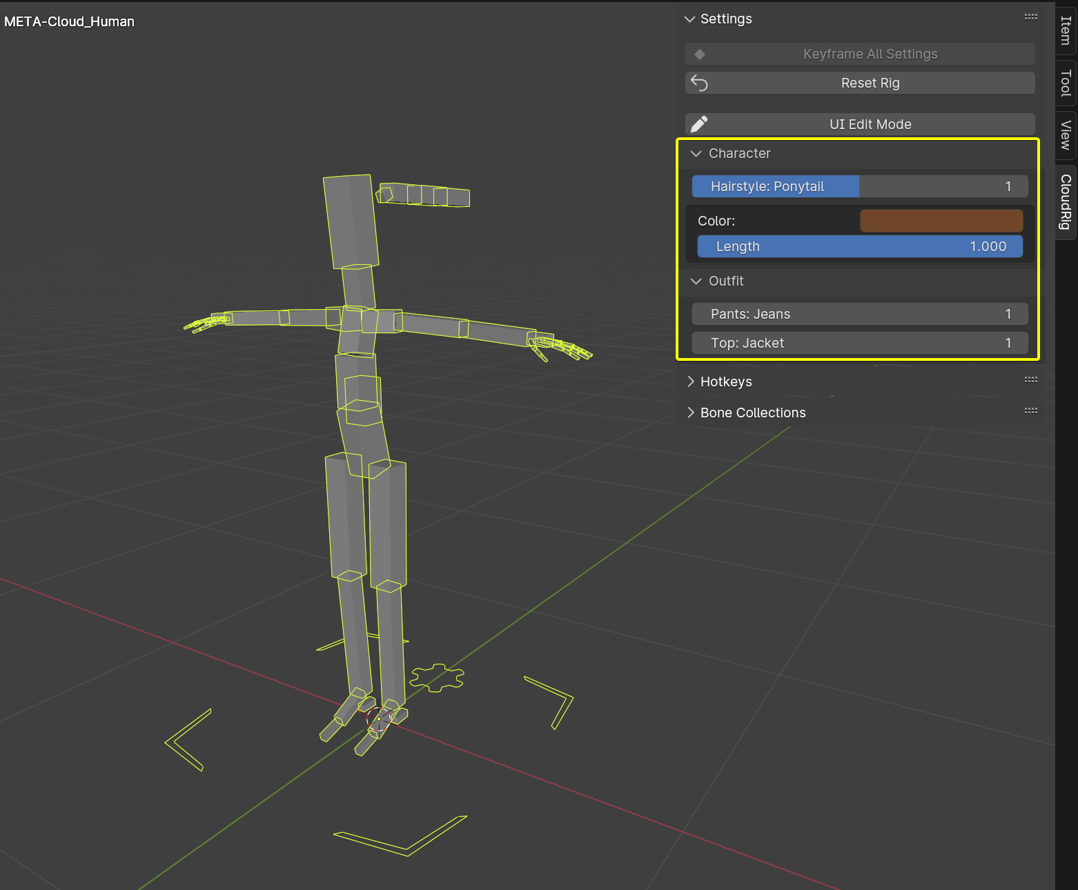
If you find Blender's built-in way of displaying custom properties a bit ugly, limited, and disorganized, that's when CloudRig can offer a bit of help. You can see an example of this on the Cloud Human Metarig.
With CloudRig's UI editor you can:
- Organize properties into collapsible panels.
- Display built-in properties alongside custom properties.
- Put properties under text labels.
- Put more than one property in a single row.
- Easily change the order in which panels, labels, and rows are displayed.
- Have hierarchical properties, where a property is only displayed under another property when it has certain values. Useful for complex clothing options.
- Have one Python Operator displayed next to each property. For example, the generation process creates IK/FK snapping buttons next to their relevant properties.
- Easily work with Blender's linking system, because the Library Overridable setting of displayed properties will be enabled automatically.
- Display a custom name for each value of an Integer or Boolean property.
- Display custom icons for the True/False states of a Boolean property.
UI Editing Workflow
Step 1: Enabling UI Edit Mode
Let's say you want to add a property to your rig's Settings panel. You can find CloudRig's Properties UI Editor by selecting any armature with the CloudRig setting enabled (ie. a metarig), and navigating to: 3D View -> Sidebar (N-panel) -> CloudRig -> Settings -> UI Edit Mode.
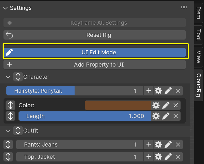
Enabling this mode reveals (among other things) the "Add Property to UI" button. This pops up the following panel, where you can fill in all the info about what/where/how you want to add to the UI. These are all explained in the next section.
Step 2: Adding (or editing) a UI Element
Whether you're adding a new UI element or editing an existing one, you will see this same pop-up: 
- Bone icon: When enabled, it lets you easily select a bone as the property owner, rather than having to type in the RNA Path of the bone like
pose.bones["Root"]. - Collection icon: When enabled, it lets you easily select a bone collection as the property owner, rather than having to type in the RNA Path of the collection like
data.collections_all["IK Controls"]. - Property Owner: When neither of the previous two options are enabled, you can type in the RNA Path to any property. For example,
pose.bones["Spine"].constraints["Stretch To"]will point at the Stretch To constraint on the Spine bone. - Property Name: Name of the property on the selected property owner.
- To continue the above constraint example, you could type
influencein this field, to simply add the constraint's influence slider to the UI. - If the chosen property owner has Custom Properties, a drop-down selector will be shown of existing ones.
- Plus icon: Instead of using the drop-down selector, type in anything, allowing you to create a new property.
- List icon: Instead of selecting a single property, add ALL custom properties of the selected owner.
- To continue the above constraint example, you could type
The remaining settings are optional:
- Hierarchy icon: Toggle whether you want to add a UI element to a sub-panel, or a child element to an existing element.
- Subpanel: Name of the sub-panel this UI element should be added to. Can be empty, and then it will be placed outside of any sub-panels.
- Parent Element: A drop-down selector of all current UI elements. Only visible when the Hierarchy icon is enabled.
- Parent Value: What value the parent element's property must be, in order for this property to be visible. You can type in a single number, or comma-separated numbers, like
1, 2, 3.
- Parent Value: What value the parent element's property must be, in order for this property to be visible. You can type in a single number, or comma-separated numbers, like
- Label: If specified, the property will be displayed under this text label. Handy for categorizing things within a panel.
- Row ID: When two UI elements share a panel, a label, and a Row ID, they will be displayed next to each other. Handy for left/right properties, or for grouping bone collections.
- Display Name: For when you change your mind about the name of a property, but that property has already been used in animations. Changing the name of the property would break those animations, but you can always change the display name without any consequence.
- Value Names: Only for Integer and Boolean properties, you can enter a comma-separated list of strings here, eg.
-, Default, Fancy. This will make it so that "Default" is displayed when the value is 1, and "Fancy" will be displayed when the value is 2. You still need to enter a string for the value 0, even if your property will not use it, which is why I started with a-,in this example. - True/False Icon: Only for Boolean properties. You can choose a custom icon for each state.
- Draw as Slider: Only for Integer/Float properties. Whether the property should be displayed as a slider.
- Expand Enum: Only for Enum properties. Whether all enum values should be displayed in a row, rather than as a dropdown list.
- Operator: You can choose a single operator to be displayed next to this property.
- Selecting an operator will display all available options for that operator, and you can specify them all.
- Operator Icon: You can also choose an icon to use for this operator.
That's a lot of options, but most of them are optional, you never see them all at once, and you can edit them any time, so don't feel overwhelmed.
In the example image above, I've pressed the + icon, which let me type in anything, and since the "Shoes" property didn't exist yet on the selected bone, it got created with a value of 1.0.
Step 3: Configuring a Custom Property
Let's use the gear cog icon to bring up Blender's built-in custom property editing operator, and change it to an integer, set the default, min, max, and a tooltip.
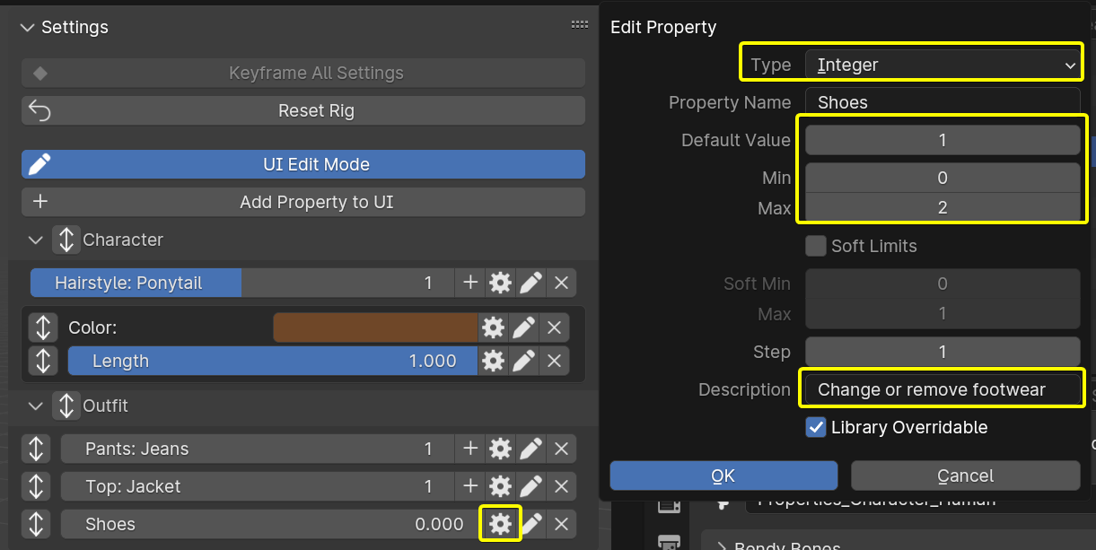
Also note that the Library Overridable flag is already enabled. This happened automatically in the previous step. This allows the property to be used even when the rig is linked to another .blend file.
Step 4: Managing UI Elements.
Along with the gear cog, we have a few other icons next to each property while UI Edit Mode is enabled.
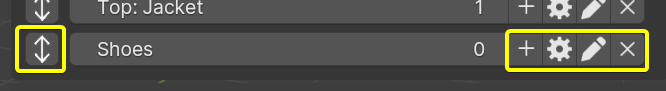
- Double-Arrow: You can re-order elements within an area by clicking on this, then moving your mouse up and down, then left click to confirm or right click to cancel. Simple as that! The button won't be visible if there's a single element in the area.
- Plus: Add child properties, which will only appear when this property has certain values. Useful for complex outfits.
- Gear Cog: Blender's built-in custom property editing operator, as explained above.
- Pencil: This lets you edit the UI data of a UI element, as described below.
- X: This lets you remove the property from the UI. If you hold Shift while clicking this, it will also remove the underlying property itself.
Step 5: Editing a UI Element
The pencil icon next to a property lets you edit the property's CloudRig UI settings:
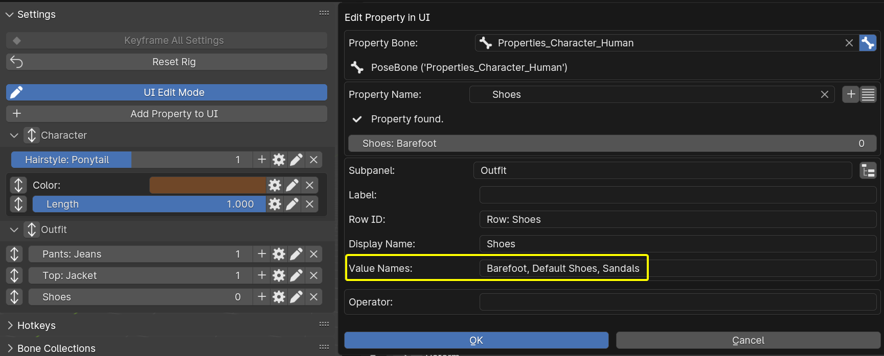
As you can see, this looks identical to adding a UI Element. In this case, I just wanted to edit the Value Names of the property. Now it will show the specified words for each value:
- 0: "Barefoot"
- 1: "Default Shoes"
- 2: "Sandals"
You can see a preview of this near the top of the pop-up panel, but you will only see it in the real UI once you confirm by clicking OK.
Some things to note:
- Drop-down selectors (Enum Properties) are also possible to create, but you need to use Python.
- The "Row ID" and "Display Name" fields were filled in automatically when we added the property to the UI.
Drivers
Of course at the end of the day, these properties don't do anything on their own. They need to be hooked up to things using Drivers. You can do this by right-clicking on properties and using the "Copy as New Driver", "Paste Driver", and "Edit Driver" options. You can learn more from the Drivers section of my rigging fundamentals tutorial.
Example Use Case: Bone Collections
Besides outfit swapping, you can also use this system to make a grid UI of Bone Collections, like so: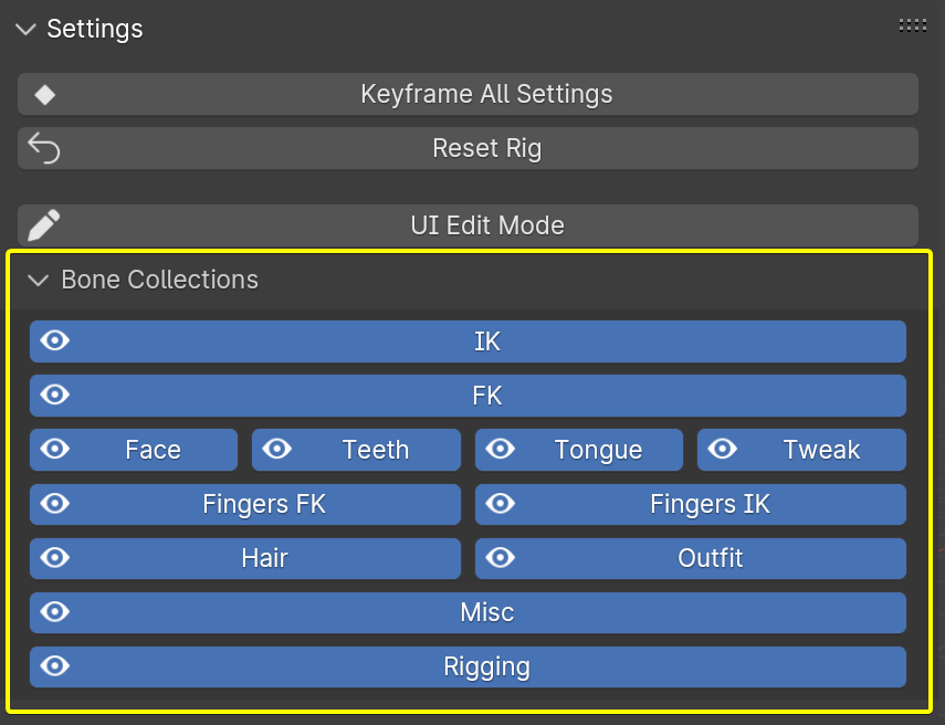
Which is made super convenient by using the Collection toggle in the top-right, which lets you select collections by name, and assigns sensible defaults so you don't need to do anything else:

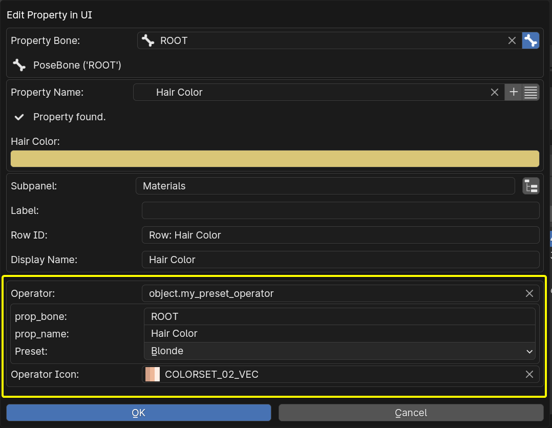
Example Use Case: Custom Operator
You can implement your own Python operator in a text datablock, then display it next to a property. CloudRig's generation process uses this to add the IK/FK snapping&baking operators, among others.
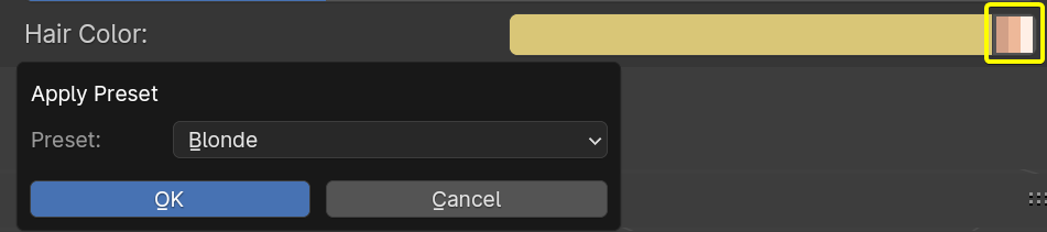
This example implements a preset button for hair colors:
import bpy
from bpy.props import StringProperty, EnumProperty

presets = {
    'Blonde' : [0.696779, 0.565850, 0.183357],
    'Dark' : [0.065083, 0.015941, 0.004878],
    'Green' : [0.007476, 0.196397, 0.007357]
}

class MyPresetOperator(bpy.types.Operator):
    """Set some properties according to a hard-coded preset"""
    bl_idname = "object.my_preset_operator"
    bl_label = "Apply Preset"

    prop_bone: StringProperty()
    prop_name: StringProperty()
    preset_color: EnumProperty(
    name="Preset",
    items=[
        ('Blonde', 'Blonde', 'Blonde'),
        ('Dark', 'Dark', 'Dark'),
        ('Green', 'Green', 'Green'),
    ])

    @classmethod
    def poll(cls, context):
        return context.active_object is not None

    def invoke(self, context, _event):
        return context.window_manager.invoke_props_dialog(self)

    def draw(self, context):
        self.layout.prop(self, 'preset_color')

    def execute(self, context):
        prop_bone = context.active_object.pose.bones[self.prop_bone]
        prop_bone[self.prop_name] = presets[self.preset_color]
        return {'FINISHED'}

def register():
    bpy.utils.register_class(MyPresetOperator)

def unregister():
    bpy.utils.unregister_class(MyPresetOperator)

if __name__ == "__main__":
    register()
Then add a color custom property to the UI, and configure this operator next to it, like so:
And the resulting UI looks like this: